start assessing
Most healthcare apps fail because they assume rational users
In moments of illness or uncertainty, people aren’t methodical—they’re overwhelmed and stressed. Most digital health tools worsen this by presenting dense symptom lists, clinical jargon, and rigid diagnosis logic that make users feel confused rather than supported.
Diagnosa was designed to intervene not by diagnosing, but by guiding users toward informed decisions at the exact moment they feel unsure.
The real problem wasn’t “self‑diagnosis” — it was cognitive overload
Early research revealed that the challenge wasn’t lack of information—it was too much of it at the wrong time. Users didn’t want a definitive diagnosis; they wanted clarity about next steps.
Presenting medical conditions without context only increased anxiety, leading to hesitation or abandonment.
This insight reframed Diagnosa from a diagnostic tool into a decision‑support experience focused on reducing uncertainty.
Constraints that shaped the entire product
Diagnosa was intentionally scoped based on real constraints:
- No medical diagnosis claims — this avoids legal/ethical issues
- Users often feel anxious or unsettled when checking symptoms
- Medical terminology can reduce comprehension, especially under stress
- The product had to feel calm, trustworthy, and supportive
These constraints weren’t limitations—they defined success.
Research insights that changed the direction
User patterns showed:
- Users skim aggressively and skip dense clinical content
- Long lists of symptoms increase anxiety rather than clarity
- People preferred guided, step‑by‑step assessment
- Match % feedback (relative likelihoods) helps with direction but must be brief and clear
The defining product decision
We deliberately reduced medical depth and structured the flow to prioritize clarity and emotion regulation.
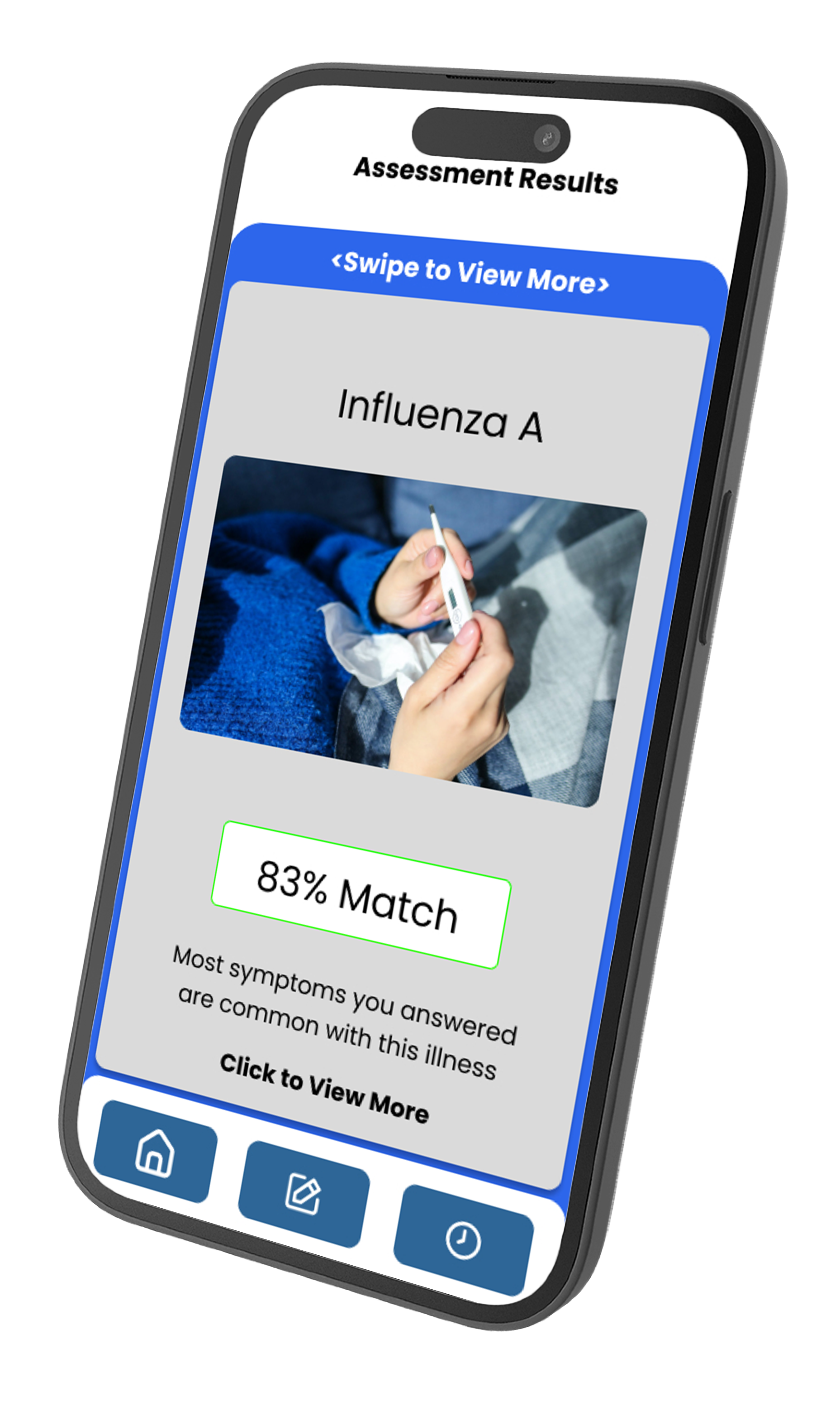
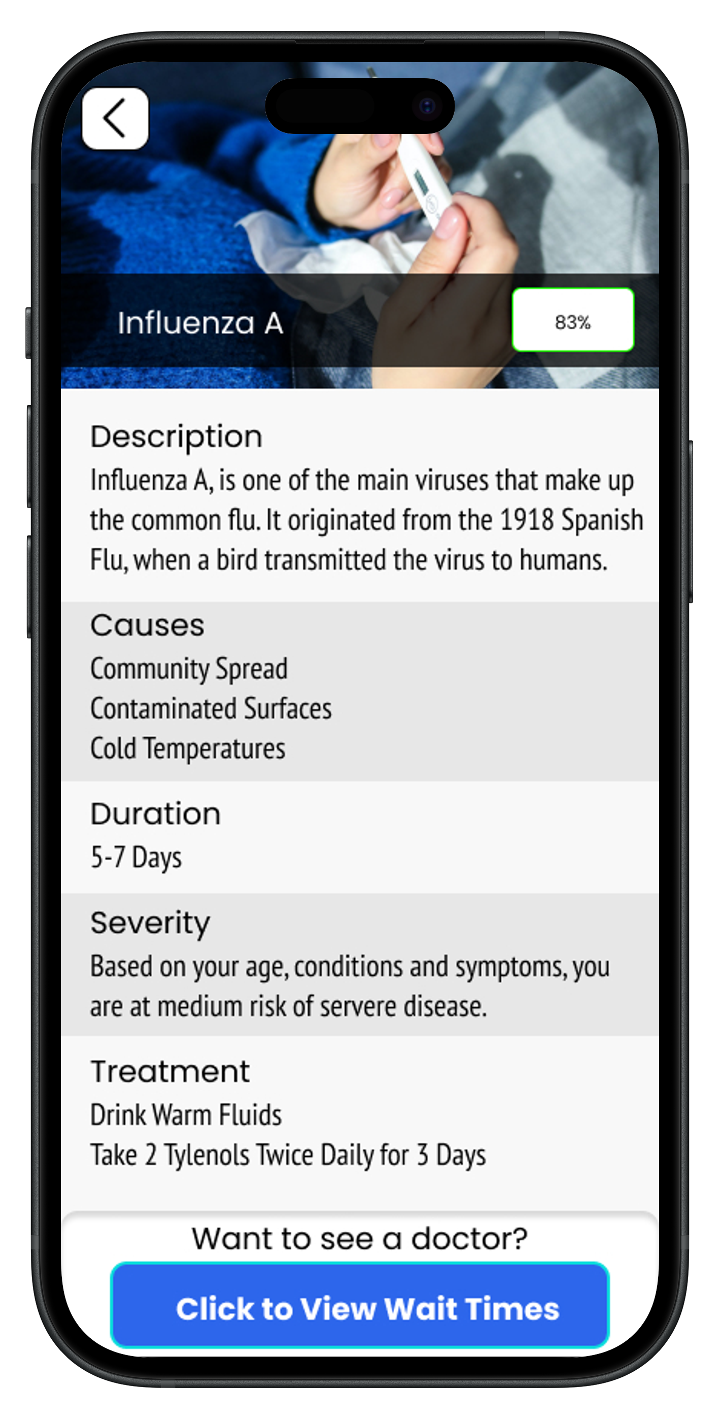
Instead of presenting exhaustive conditions or complex probabilities, Diagnosa leads users through a focused self‑assessment, offering card‑based match percentages with plain‑language explanations.
This trade‑off—focus over completeness—was central to the product.
What Diagnosa intentionally does not do
Several common features were discussed but deliberately excluded because they increased uncertainty or cognitive load:
- No condition encyclopedias
- No high‑detail diagnostic logic
- No open‑ended free text symptom entry
- No clinical‑style severity rankings
Diagnosa doesn’t tell users what they have.
It helps users answer what they should do next.
Designing the self‑assessment flow
The experience was built around three principles:
- Progressive disclosure — only present info when it’s relevant
- Plain‑language framing — user terms, not medical jargon
- Clear stopping points — users always understand where they are
After the assessment, users see card‑based match percentages showing the likelihood of possible conditions. Each card includes a plain‑language summary, reassurance, and guidance toward next steps.
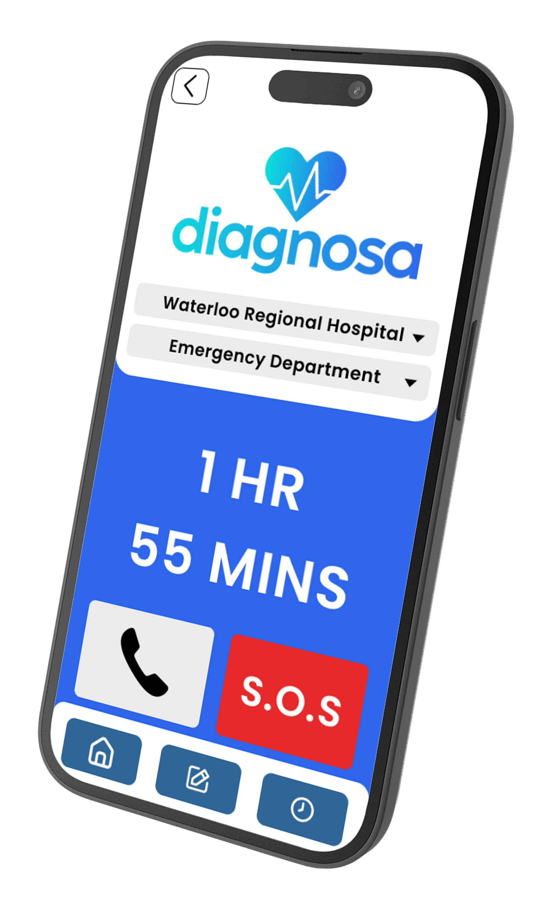
Hospital wait times as a supporting flow
Hospital wait times were integrated as a secondary decision‑support feature, not the core experience.
They provide:
- Visibility into emergency room delays
- Context for urgency in decision‑making
- Reassurance when symptoms suggest escalation
Including wait times after the assessment—rather than upfront—reduced confusion and kept the focus on user understanding first.
Outcome
Diagnosa demonstrated that:
- Less information delivered in clearer steps increased user confidence
- Match % cards offered direction without delivering false certainty
- Structured guidance outperformed static symptom listings
Users consistently reported:
“This helped me decide what to do next”
“I felt less anxious than using Google”
“I understood urgency more clearly”
What this project taught me
Designing for healthcare means designing for emotion first, logic second.
True clarity isn’t about volume of information—it’s about timing and presentation.